Brand Identity
A visual identity system engineered to capture your brand essence, differentiate you in the market, and scale across every touchpoint.
The Problem
Your visual identity is often the first interaction someone has with your brand. A generic logo, inconsistent color usage, or mismatched typography signals to your audience that you haven't thought carefully about who you are — or worse, that you don't care.
Inconsistent visual identity creates friction at every level. Your sales team uses one version of the logo, your website uses another, and your social media looks like it belongs to a different company entirely. This erodes trust, dilutes recognition, and makes your brand forgettable.
Solution: Brand Identity
Brand identity goes far beyond a logo. It's a complete visual system — logo, color palette, typography, imagery direction, iconography, and usage guidelines — designed to work cohesively across digital, print, environmental, and motion contexts.
A well-built identity system is both distinctive and flexible. It looks unmistakably like your brand whether it appears on a billboard, a mobile screen, a product label, or an investor deck.
Our Approach
Phase 1: Strategic Alignment
Before we design anything, we ground the work in strategy. If you've completed a brand strategy engagement with us, we build directly from your brand platform. If not, we conduct a focused discovery phase to understand your positioning, audience, and competitive context.
Design without strategy is decoration. Every visual decision we make traces back to a strategic rationale.
Phase 2: Visual Exploration
We develop multiple creative directions, each representing a distinct interpretation of your brand's strategic foundation. These aren't random concepts — they're informed explorations that map to different facets of your positioning.
Each direction includes preliminary logo concepts, color territory, typographic approach, and mood references. We present these with strategic annotations so you understand the thinking behind every choice.
Phase 3: Logo Design and Refinement
The logo is the cornerstone of your visual identity. We design primary, secondary, and submark variations — ensuring your logo works at every scale, in every context, and on every background.
Our logo design process is meticulous. We test for legibility at small sizes, evaluate across color and monochrome applications, and refine until every curve, weight, and proportion is intentional.
Phase 4: System Development and Guidelines
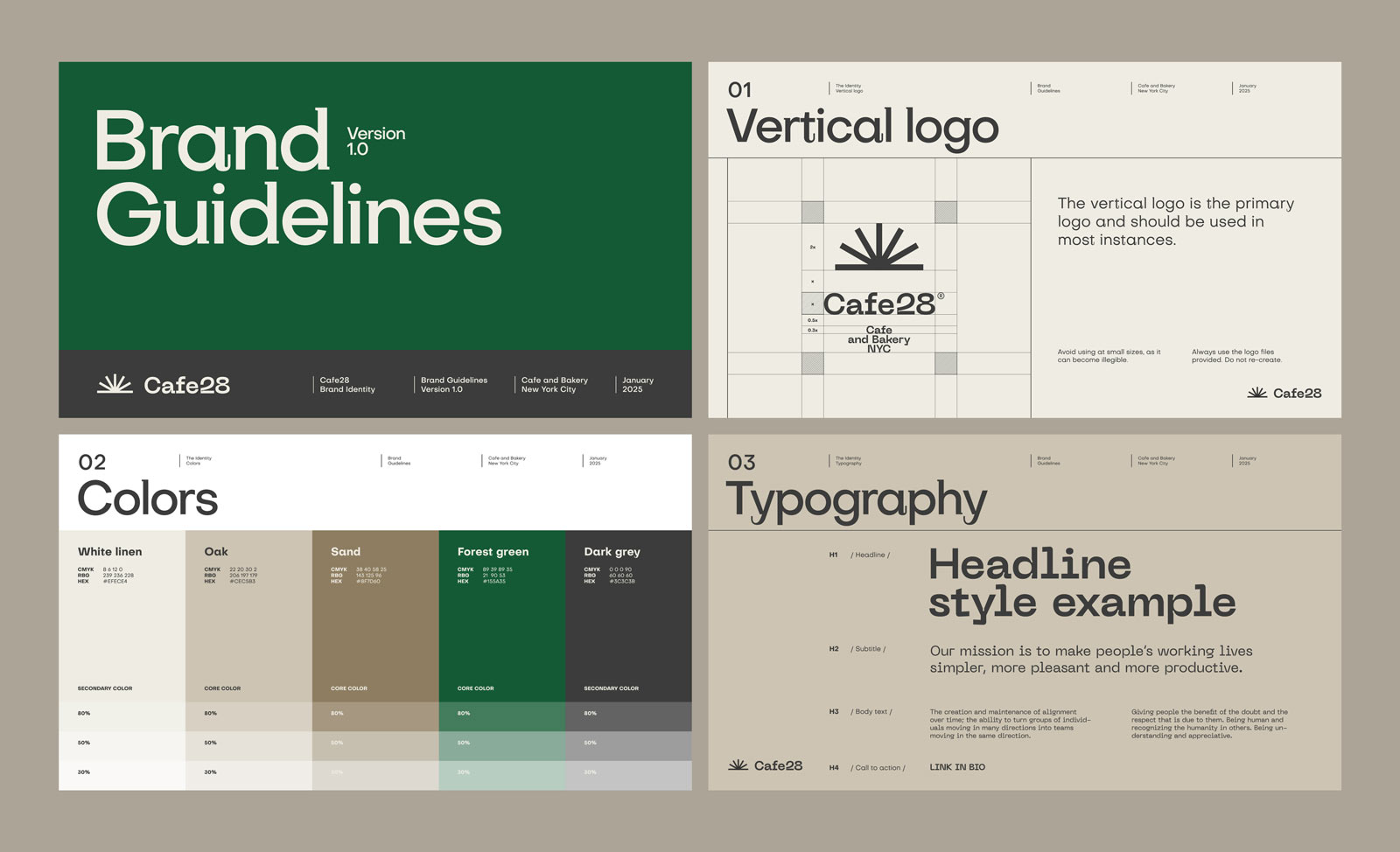
With the logo finalized, we build out the full visual system. This includes your complete color palette, typography hierarchy, imagery direction, iconography style, and usage guidelines documented in a comprehensive brand guidelines package.
Every element is designed to work together as a unified system. We specify usage rules, spacing requirements, minimum sizes, and clear space to ensure consistency across all applications.
What You Get
Complete Logo Suite
Primary logo, secondary lockup, submark/icon, and wordmark — each delivered in full color, monochrome, reversed, and single-color variants across all file formats.
Comprehensive Color Palette
A complete color system with primary, secondary, neutral, and accent colors specified in HEX, RGB, CMYK, and Pantone with usage guidelines.
Typography System
A defined type hierarchy with font pairings selected for both aesthetic harmony and practical licensing considerations.
Imagery and Photography Direction
A visual style guide for photography, illustration, and imagery — including composition guidelines and on-brand examples.
Brand Guidelines Document
A comprehensive guidelines document covering logo usage, color application, typography, imagery standards, and co-branding rules.
Digital Asset Library
An organized package of all brand assets, formatted and named for immediate use across web, social, print, and presentation contexts.
Ready to Define Your Visual Identity?
Your brand deserves a visual system built with the same rigor as your product. Let's start the conversation.
Get in Touch